Saturday, April 19, 2014

How to Market a Mobile App: Professional Review Sites

Mobi Apps Review

I've been working on the revealing (and humbling) How to Market a Mobile App series so I've found myself more open to some ideas that I usually am. A few months ago, I got an email from the owner of Mobi Apps Review. I've heard about sites like this before that establish a viewership on their website and on social networks. Some friends tried it out paying as much as $5,000 for one review.

Mobi purported to have 25,000 followers on twitter and the same on facebook. The offer was to write a review and publish it on all of their social networks for $25. I figured, it's worth 25 bucks just to know what a little exposure could do for me. Besides, it'll give me something to post about on the Mobile Magic Developers facebook page.

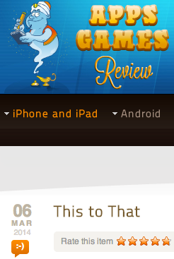
The Mobi Apps Review of This to That came out March 6th, 2014. It was nice to see that the review was generally positive. Not all of the reviews on Mobi are positive so I feel like the reviewer really did enjoy the game.

Results

I reviewed the Google Analytics for the 3 weeks before and the 3 weeks after the Mobi review was posted. I saw no discernible effect on new users.

Conclusion

I don't think the lack of results necessarily indicates that the review had no impact. To be sure, I could've spent more effort promoting the review. I also, unfortunately, have no insight into how many viewers actually saw the review. Of those viewers, I have no idea how many visited the This to That for iOS app store page. Even if I did, I have no way of knowing how many people who view the app store page actually download the application and whether or not the review had an impact on that.

All in all, I think it was worth 25 dollars, and I expect to get value out of it at some point. Now, I can mention the 5 star review in the profile description which needs to be revamped anyhow. I can also reference it in posts on our facebook page. The gestalt effect of having an additional third-party link out there is likely to help support my efforts in marketing This to That.

How to Market a Mobile App: Design Counts

Default theme progression

As I discussed previously in the How to Market a Mobile App series, one of the first things I could do to improve user experience in This to That for iOS is not only to support the look and feel of iOS 7 but also to improve the color selections of the default theme. At the time I released the latest version of This to That, the iOS 6 SSL vulnerability hadn't been discovered yet, so I have a new default iOS 6.0 theme (that nobody will ever see again). :)

Results

There were no notable changes in new user acquisitions nor in returning user frequency. There may have been a slight reduction in session time and a slight increase in screen views per session. Reviews are still generally positive, but it appears changing the theme had very little impact on the performance of the application

Next Steps

I had a new icon designed professionally. I made the current icon and while I think it's pretty cool, it definitely doesn't look quite as engaging as the new one does. I need to re-release This to That with that icon in hopes that it increases new user acquisition.

Screenshots

Each set of screenshots shows the original theme on the left, the new default iOS 6 theme in the middle, and the new flat iOS 7 theme on the right. You can still select the "reflective" tile type in the theme builder to get the old look and feel, but the linen background is no longer available to iOS 7 users. Instead, it's just gray.

Basically, the theme is lighter, flatter, and sharper. The last few images demonstrate the difference in texts. Instead of inlaid icons for the letters, they're all just flat letters in a built in system font. Eventually, I think I'd like to switch the fonts throughout the application to use iOS 7's default font.

Default theme progression

Letter selector theme progression

Complete game theme progression

History theme progression

Game font changes

Letter selector font changes