
As I discussed previously in the How to Market a Mobile App series, one of the first things I could do to improve user experience in This to That for iOS is not only to support the look and feel of iOS 7 but also to improve the color selections of the default theme. At the time I released the latest version of This to That, the iOS 6 SSL vulnerability hadn't been discovered yet, so I have a new default iOS 6.0 theme (that nobody will ever see again). :)
Results
There were no notable changes in new user acquisitions nor in returning user frequency. There may have been a slight reduction in session time and a slight increase in screen views per session. Reviews are still generally positive, but it appears changing the theme had very little impact on the performance of the application
Next Steps
I had a new icon designed professionally. I made the current icon and while I think it's pretty cool, it definitely doesn't look quite as engaging as the new one does. I need to re-release This to That with that icon in hopes that it increases new user acquisition.
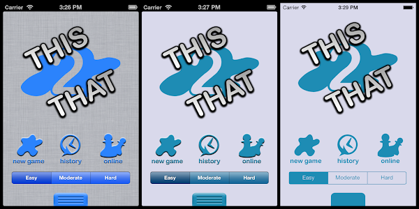
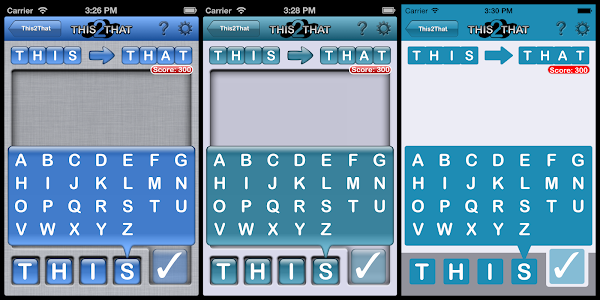
Screenshots
Each set of screenshots shows the original theme on the left, the new default iOS 6 theme in the middle, and the new flat iOS 7 theme on the right. You can still select the "reflective" tile type in the theme builder to get the old look and feel, but the linen background is no longer available to iOS 7 users. Instead, it's just gray.
Basically, the theme is lighter, flatter, and sharper. The last few images demonstrate the difference in texts. Instead of inlaid icons for the letters, they're all just flat letters in a built in system font. Eventually, I think I'd like to switch the fonts throughout the application to use iOS 7's default font.


No comments:
Post a Comment